
A personal services provider does not choose its logo the way a retail business does. Regulations require the official SAP logo to appear on quotes, invoices and advertising materials alongside the brand logo. Every design must therefore account for this requirement from the outset: two distinct marks, each clearly legible on its own, with no confusion about their status.
Brand logo and SAP logo: using both on regulated materials
The SAP logo is not a decorative element. Registered providers must display it on their business documents. The company logo cannot replace it or absorb it into a merged design.
In practice, this means that providers developing their visual identity must allow for a clear space around each mark. The brand logo has its own place, as does the SAP logo, with enough space between them to ensure neither is perceived as part of the other’s design.
A common pitfall is incorporating the SAP acronym into the logo as if it were a proprietary label. Someone looking at a quote may then think the company “owns” this label, when in fact it is an administrative marker linked to a registration. When a personal services logo works well, it conveys the organisation’s values without encroaching on official marks.
We recommend defining placement templates in the brand guidelines from the outset: quote headers, invoice footers and advertising banners. The designer should receive a brief that clearly distinguishes the space allocated to each mark.
Registration, accreditation and departmental authorisation: what the logo must not imply
SAP registration does not cover all activities in the same way. Some services for vulnerable people require specific accreditation, while others need departmental authorisation. A logo or visual identity that suggests general authorisation without specifying the actual scope may mislead clients.
This issue is rarely addressed in logo design guides because it sits at the intersection of law and design. The rule is simple: the logo represents the brand, not the legal scope of its activities. That scope should be specified elsewhere, in legal notices, terms and conditions, or certification signage.
Wording to watch in the tagline
The tagline (the phrase beneath the logo) is where the risk lies. Writing “All accredited personal services” when only some activities are covered by the accreditation amounts to a misleading claim.
- If the organisation only has SAP registration, the tagline should focus on values (personal attention, support) and avoid the word “accredited”.
- If accreditation covers some activities but not others, the tagline may say “accredited for [specific activity]”—provided the statement is accurate and up to date.
- If the organisation holds certifications such as NF Service, Qualicert or Qualisap, these should be displayed using their own standardised pictograms, separate from the brand logo.
Certifications can simplify the renewal of certain accreditations. Displaying a certification that has actually been obtained is better than incorporating a generic trust badge into the logo.
Colours and shapes: visual cues that work in home services
Competitors in the sector tend to favour blue and green. This is no coincidence: blue suggests reliability, while green evokes health and well-being. The challenge is to stand out within this limited palette without straying from the visual cues clients expect.
A personal services logo must work at very small sizes, on a name badge or uniform. Legibility at 2 cm wide matters more than how it looks at a large size. This rules out complex gradients, thin typefaces and illustrative details that disappear when scaled down.
Rounded or angular shapes
Rounded shapes convey approachability and warmth, making them suitable for home care services. Angular shapes suggest precision and structure, and are better suited to practical services such as cleaning and gardening. The choice depends on positioning, not on any universal rule.
A provider serving multiple sectors, offering both support for older people and small home repairs, would be better off choosing a neutral shape (circle, oval) and distinguishing its services with secondary pictograms in its materials, rather than in the logo itself.

Adapting the logo for on-the-ground personal services materials
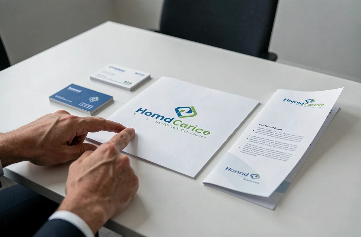
The sector has its own specific materials: business cards handed out in clients’ homes, service vehicles, staff aprons or polo shirts, and notices displayed at town halls or CCAS offices. Each format comes with constraints that most logo design guides overlook.
- On clothing (polo shirts, jackets), embroidery limits the design to three colours and rules out gradients. A logo designed only for digital use will need to be adapted, adding to costs.
- On vehicles, the logo must remain legible in motion. Fine details disappear beyond a few metres. A monochrome version of the logo should be planned from the outset.
- On quotes and invoices, the logo appears alongside the SAP logo and, where applicable, certification pictograms. The brand guidelines should establish a clear visual hierarchy between these elements.
The sector is also evolving in relation to the exclusive-activity requirement. A company that expands its services beyond the scope of SAP must ensure its brand identity does not suggest that all its activities qualify for the tax benefits associated with personal services.
A well-designed logo for this sector is not judged by its visual appeal. It is measured by its ability to coexist with regulatory marks, remain legible on a 3 cm badge and convey a promise that accurately reflects the scope of the provider’s registered activities.